Thursday, June 21, 2012
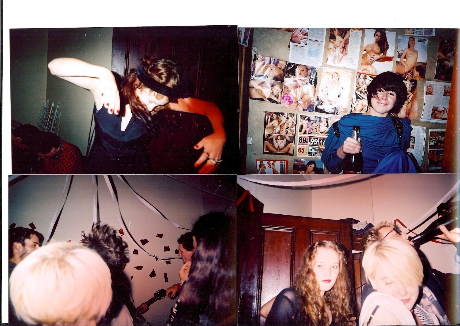
Marrow Launch Party June 16th 2012
A HEX4NEXTDOOR / ZEBU / SEWAGE / THE YELLOW MEN / QTPI / FERAL HUNKS. GLUE, 26 STAFFORD STREET, DUNEDIN, NZ. 12-6PM, JUNE 16, 2012
saturday crafternoon
saturday crafternoon
Thursday, June 14, 2012


LUCY FULFORD autumn issue


Models Elza and Nellie Jenkins Ali McD
Photos Lucy Fulford Lucyfulford.co.nz
Styling Hana Aoake
Assistant Lucy Fulford
Shot at Seacliff

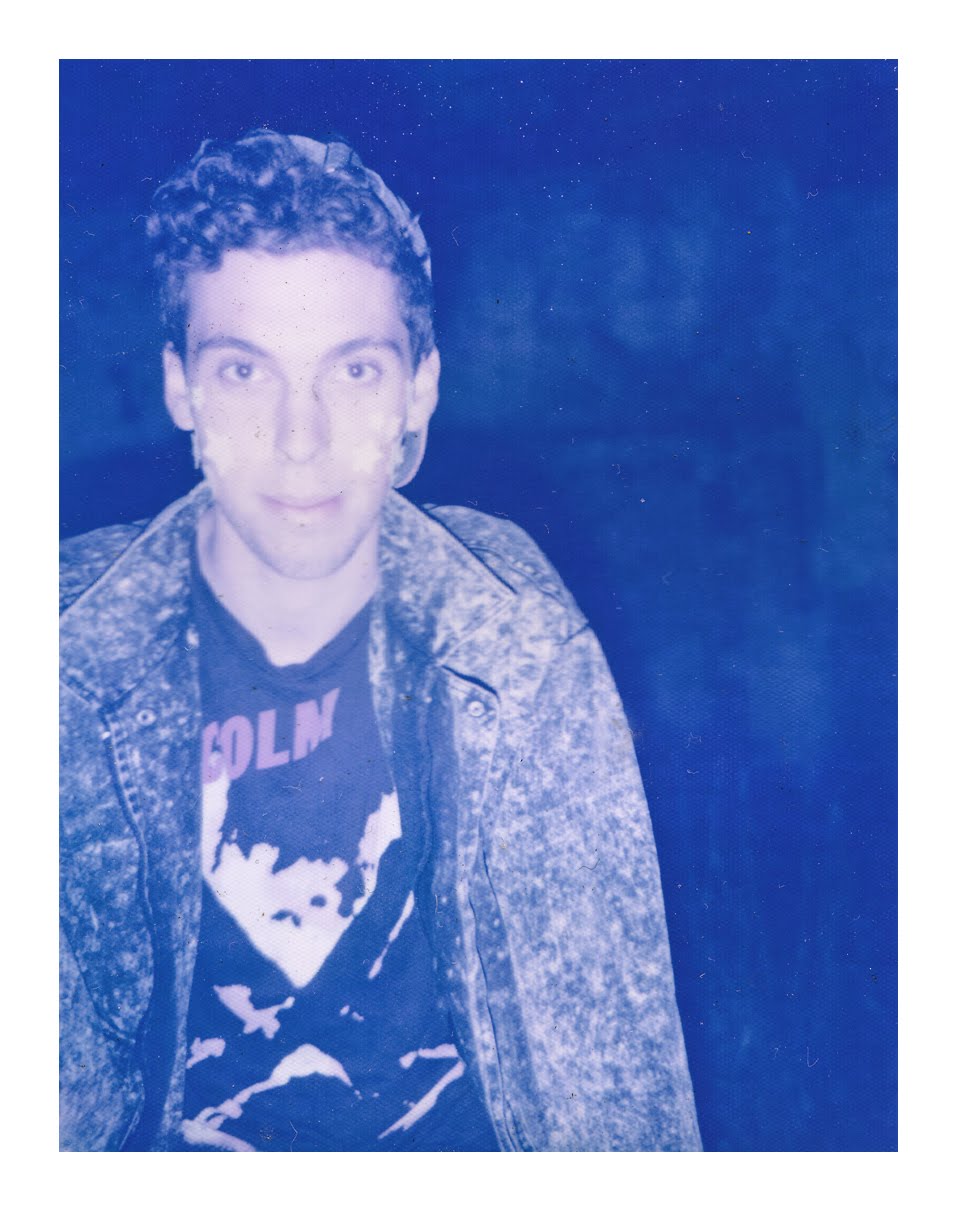
The Yellow Men AUTUMN ISSUE


The project began after both discussed their mutual interest in endurance based performance works, particularly the work of seminal performance artist Chris Burden. Burden’s work is marked by both his endurance based performances, but also mortal danger and physical pain. While the McMannon & Hegan were interested in creating endurance based works, their interest lay primarily with the subsequent experience of pain. Rather than doing an action which would be purposefully harmful to themselves they sought to reach a point of uncomfortable pain.
By choosing to stage such performances in a public space McMannon and Hegan were also engaging with art historical references to controversies involving art in the public sphere, most notably Richard Serra’s seminal Tilted Arc (1981). Tilted Arc was a public sculpture commissioned by the United States General Services Administration’s Arts-in-Architecture program for the Federal Plaza in New York, NY, USA. After intense public debate the work was controversially dismantled in 1989. Both artists agree that while the work was a successful sculpture, it did not succeed as a public sculpture, due to the fact of the environment in which it was placed. The work obstructed the path of those who had to interact with it daily. The yellow men project was founded upon this idea of obstructing the unknowing viewer’s path and thus forcing them to both engage and participate in each of their works however fleeting this engagement may have been. In doing this the Yellow men project was perhaps subconsciously aligning themselves also with the ‘Living sculpture’ works by Gilbert and George. This kind of confrontation had a varied response, but by the mere ritual of having to do a weekly performance this enabled both artists to refine their practice in the safety of the institution.
At the Qubit contemporary performance series at the Anteroom gallery, the Yellow men performed for the first time in a gallery space, with interesting results. Blow consisted of the simple act of blowing up an inflatable swimming pool and deflating it over and over again. This mundane act challenged the viewer’s engagement simply for the fact that the viewer immediately became aware of what both artists were doing and largely disengaged. Did it change? Or did it largely remain the same? This subtle performance did change over time, with both their bodies twisting and contorting through the uncomfortable process of squeezing air out of their lungs. Blow gradually became more physically grueling for both artists. But because of the majority of audience’s disengagement did this mean that the performance lost meaning, because of it’s repetitive nature? Or was it success in proving that repeating the same action can dislocate meaning? Wet, the second performance by the Yellow men initiated a completely different response, although it largely followed the same principal. It was utterly gut wrenchingly difficult and captivating to watch. Wet involved both McMannon and Hegan filling the paddling pool used in Blow with water. Then both artists sat cross legged in the pool, faced each other and then took turns at pours cups of water on each other’s heads. At first the atmosphere within the gallery was that of disengagement, but as the performance progressed the room became transfixed by the figures before us, as we watched them shiver in a self-perpetuated agony. I wanted to make them stop and drag them out and shove blankets on them, but I sat and watched this silent ritual and mediated upon the associations of such an action. My immediate response was that it reminded me of the process of baptism. It also communicated a collective frustration at both wanting to make the performance stop, yet remaining absolutely magnetically glued to their every movement.
Currently both artists are working on individual projects, with both continuing to look at both ritual and endurance based performances. They will both also be a part of a group show reconceptualising the current Mural show of New Zealand expressionist works, curated by Aaron Kreisler and Fiona O’Connor at the Dunedin Public art gallery in June.
$noregazZzm AUTUMN ISSUE


Photos: Lucy Fulford (lucyfulford.co.nz)
Styling: Hana Aoake (bellaandmadeline.blogspot.co.nz)
Clothing: (Modern Miss Vintage Clothing, 21 Moray Place, Dunedin violetfaigan@yahoo.co.nz)
Gideon Smit (Gideon@chrysalisfilms.co.nz http://www.chrysalisfilms.co.nz/)
Photos taken at Lover's leap, Dunedin Peninsula.
Agata Michalczyk

Each photograph is a poignantly executed self-portrait, which in essence describes Michalczyk’s emotional and nomadic journey from her homeland in Poland ten years ago. The title of the series refers to reflecting back upon this time spent long from home. Although each image portrays a sense of longing; etched within each is a memory, sense of establishing one’s identity and a sense of place and belonging. Michalczyk graduated from the Otago Polytechnic School of art with a bachelor of visual art (BVA) in photography. Michalczyk’s grew up in Soviet-era Poland in a four storey concrete block and lived with sixteen other families. Ten years ago governed by an itching to leave, Michalczyk moved to Ireland, where she struggled and then gradually adjusted to the cultural distinctions and lingual barriers. Since then she has lived what may be described as a nomadic existence, fuelled by her curiosity in exploring the world. “When you live in another country, you appreciate where you come from.” Like many of us who have travelled the experience fundamentally changes who you are as a person. For Michalczyk it has engrained her with a sense of patriotism for her homeland.

One of the most powerful images in the series is of the artist looking out into what can be described as a quintessentially New Zealand landscape in traditional Polish dress. It has an almost startling quality, which can leave one feeling breathless. In this work Michalczyk stares out aimlessly into the landscape, with her back turned to us, it suggests both nostalgia and isolation. It is rendered to a psychological, geographical and lingual reflection upon the distance between Poland and New Zealand, the unfamiliar and the familiar. But perhaps this work also suggests that Michalczyk has found a sense of place here in New Zealand, but originating from Poland will always represent who she is.
Lying in a milky white bath, Michalczyk gazes up in a sea of apples. This work is intrinsically nostalgic. It permeates upon the idea of memory, as a child Michalczyk recalled continuously eating apples and the lack of fruit variety available to people who lived in the on the Soviet bloc. The image itself is captivatingly absorbing, as the eye roves from the ghost like purity of the bath water to the boldly coloured apples and the artist’s delicate features floating in the water. The use of water also suggests the notion of rebirth.

All photos by Agata Michaelczyk
The jewellery of Lucy Noone


The use of toffee was an exhaustive exercise of trying to predict how it would change over time. This was due primarily to the sugar inside of the toffee reacting to atmospheric conditions. The toffee inside these bottles is constantly changing and moulding into something new. The toffee is in fact burnt and is of much deeper, richer colour than that of what we could actually eat. The necklaces made of Mylar and shaped like tiny little houses were hand sewn. Each work is so delicately refined and seemingltoddly so precious.Through the reference to both craft and the kitchen, Noone’s work is innately feminine. The collection examines the whole notion of ‘high’ and ‘low’ art hierarchies; through it’s incorporation of craft technique and the female’s role as a housewife. The collection is based upon the idea of a repressed traditional house wife, who expresses herself through the food she prepares in the kitchen. On a deeper level the works are a fundamental rejection of the idea that the ‘man brings home the bacon’ and the ‘women cook’. These works are a rejection of the gender roles in which we are socialised to uphold. Noone’s collection can be aligned to the idea of the ‘maternal’ body, through her use of materials and the use of text in reference to the semiotic. The series of symbols which appear throughout each work signifies the intended disruption of art historical hegemonies. At the very core of Lucy Noone’s jewellery is a celebration of the maternal, of cooking and of memory. It is both an examination of the gender roles and the connotations we associate with cooking. P
hotos: Lucy Fulford (lucyfulford.co.nz)
Styling: Hana Aoake Model:
Kayleigh from Ali McD


Grace Averis AUTUMN ISSUE

-Grace Averis
Grace Averis is a recent graduate from the Otago Polytechnic fashion school. Averis’ graduate collection My evil eye combines the use of both wood, silks and cotton. Creating the collection was time consuming, labor intensive and obviously quite experimental process. She credits the literary works of Salman Rushdie, in particular his novel Shalimar the Clown, as inspiration. Each wooden piece involved having to be digitally mapped out using a computer programme, and then assimilated into a prototype, before being carefully constructed into the right scale and fit. The Christchurch born, Dunedin based designer will be showing her collection during the iD fashion week in Dunedin at the end of this month. “…Every garment sends a message”. Quite often I find in watching fashion shows one becomes overstimulated and unable to appreciate the finer details in each individual look. I felt that deconstructing a single look from Averis' collection could effectively connect (YOU) the reader to cohesive threads apparent throughout her entire collection. This is especially true given how overwhelming it can be to piece together a runway show after fleetingly gazing at each look; sometimes it would be helpful for a breakdown of each item that comprises a singular look.
Eyewear:
Averis used a selective selected colour palette; turquoise, black, gold and white. Each colour had corresponding complementary pieces. This enables the collection to have a strong sense of cohesion. My favourite of these looks was the turquoise, which emanated a feeling of rational calm, yet was incredibly bold. Each look had a corresponding pair of wooden teashades, yet they are thicker than say that of the ones you would associate with 1960s counterculture. The best part about the eyewear in the collection is that they each have a chain attached, so you won’t lose them, because they are swinging around your neck. This slight embellishment plays off nicely against the hard lines of the glasses, in particular the semi-circular nose bridge. The eyewear recalls that of Karen Walker’s summer 2011 eyewear collection, particularly Pegs and Bunny.

The waistcoat is a concoction of subtle feminine embellishment and a masculine, deconstructionist approach to tailoring. The shoulders are slightly raised by the insertion of softened padding. The initial shape probably resembled more of suit jacket, but Averis has cleverly added straps which drape down of either side of the gillet. The draping straps to wander beside one’s legs are adjustable and enable the wearer whatever their size to comfortably encase themselves in the warm and extremely comfortable waistcoat. It is very much reminiscent of the kind of androgynous or rather genderless oversized silhouettes of Yohji Yamamoto, especially in the late 1980s.

Wooden Breastplate:
The resin-coated breastplate can be intrinsically associated with the ancient to early medieval armoury. It cocoons itself around the body using adjustable bondage style straps. Each of the wooden plates falls delicately into each other. Averis studied different types of armoury and appears to have created the breastplate in much the same way, only making the prototype using digital technology.


Silk Pant:
The high waisted turquoise pant is the perfect structural balance to the entire look. When worn they carry an ephemeral, weightlessness, that makes them deceptively autonomous. The pant is sheer and its lightness comes from its materiality, silk.

Model: Ella Van Ziji
Photography: Lucy Fulford (www.lucyfulford.co.nz)
Styling: Hana Aoake (bellaandmadeline.blogspot.co.nz)
Clothes: Grace Averis (graceaveris@gmail.com)


Maya and Bronwyn make theatre together
Bronwyn wears: Sale top floral, Picasso sweater, blue lace witches britches, ankle boots Modern Miss Vintage Clothing, Femur neck piece Lucy Noone.
Maya wears: Colourful HK sweater, brown leather skirt, Modern Miss Vintage Clothing, rings Jessica Kitto


 Bronwyn wears: Sale Floral top, western tie, boots, witches britches Modern Miss Vintage Clothing, College jacket Logan Armstrong
Maya wears: Chiffon tie front shirt + stripey witches britches Modern Miss Vintage Clothing, rings Jessica Kitto shoes/ remaining jewellery STYLIST


 Bronwyn wears: Pussy bow tailored shirt, jacket Grace Averis, Femur neck piece Lucy Noone and necklace Patrick Gallagher.
Maya wears: shirt swing dress, Chief's tencel piece, beaded cuffs Margot Reider, shoes Modern Miss vintage clothing, rings Jessica Kitto, Badge and necklace Patrick Gallagher


Photos by Lucy Fulford (lucyfulford.co.nz)
Styling/make up by Hana Aoake
Featuring Maya Turei and Bronwyn Wallace.
Shot at Allen Hall theatre for Marrow Magazine
Maya wears: Colourful HK sweater, brown leather skirt, Modern Miss Vintage Clothing, rings Jessica Kitto


Maya wears: Chiffon tie front shirt + stripey witches britches Modern Miss Vintage Clothing, rings Jessica Kitto shoes/ remaining jewellery STYLIST


Maya wears: shirt swing dress, Chief's tencel piece, beaded cuffs Margot Reider, shoes Modern Miss vintage clothing, rings Jessica Kitto, Badge and necklace Patrick Gallagher


Photos by Lucy Fulford (lucyfulford.co.nz)
Styling/make up by Hana Aoake
Featuring Maya Turei and Bronwyn Wallace.
Shot at Allen Hall theatre for Marrow Magazine
Subscribe to:
Posts (Atom)